Virtual PRO: Evolving Our Visual Language
Virtual PRO: Evolving Our Visual Language
How we redesigned our brand system to scale creativity—without losing the human touch. As we approached the challenge of evolving Hubilo into something new, we looked to the past for inspiration. We aligned on a few core principles, grounded in how our customers actually work.
CRAFT OVER POLISH.
DESIGNED FOR ONE-TO-MANY.
STRUCTURE THAT INVITES CREATIVITY.
UNMISTAKABLY HUMAN.
Sam Kolbert-Hyle
/
January 28, 2026
Sam Kolbert-Hyle
/
January 28, 2026
MOODBOARD to MAGIC
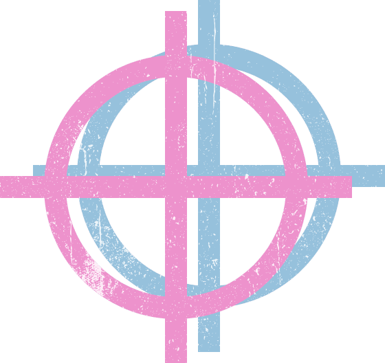
We found inspiration in one of the oldest creative systems still shaping modern design, the printing press, and more specifically, risograph printing. Risography is built on layers. Ink is applied one color at a time. Slight misalignments are expected. Texture is part of the outcome, not a flaw. The process is repeatable, yet every print carries subtle variation.
We were also drawn to a moment in modern art and design when mass production and creative authorship collided. Artists like Roy Lichtenstein embraced the mechanics of reproduction rather than hiding them. Dots were visible. Layers were exposed. Imperfection became a signal of intent. Industrial processes were transformed into expressive, cultural work that could scale widely without losing its voice. Still hanging in a museum. Valuable over time.
Our customers create experiences meant for thousands, sometimes tens of thousands, of people. But the most powerful moments never feel mechanical. They feel intentional. Personal. Alive. The dots, textures, and layered forms in our identity are a direct nod to that era. A reminder that repetition can be a strength, that craft can scale, and that humanity does not disappear with reach.
MOODBOARD to MAGIC
We found inspiration in one of the oldest creative systems still shaping modern design, the printing press, and more specifically, risograph printing. Risography is built on layers. Ink is applied one color at a time. Slight misalignments are expected. Texture is part of the outcome, not a flaw. The process is repeatable, yet every print carries subtle variation.
We were also drawn to a moment in modern art and design when mass production and creative authorship collided. Artists like Roy Lichtenstein embraced the mechanics of reproduction rather than hiding them. Dots were visible. Layers were exposed. Imperfection became a signal of intent. Industrial processes were transformed into expressive, cultural work that could scale widely without losing its voice. Still hanging in a museum. Valuable over time.
Our customers create experiences meant for thousands, sometimes tens of thousands, of people. But the most powerful moments never feel mechanical. They feel intentional. Personal. Alive. The dots, textures, and layered forms in our identity are a direct nod to that era. A reminder that repetition can be a strength, that craft can scale, and that humanity does not disappear with reach.
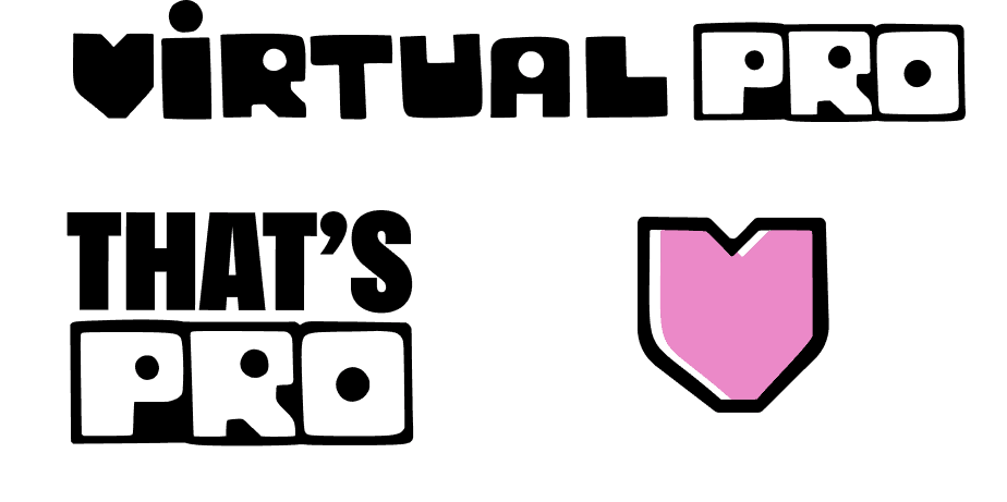
THE MARKS: A SEAL OF CRAFT
The new Virtual PRO wordmark draws directly from printmaking traditions and modern art of the 1960s. Each letter feels hand-cut and intentionally imperfect, evoking the tactile quality of analog production. The circular forms within the I, R, A, P, and O are a deliberate nod to the visual language of mid-century modern art, particularly artists like Roy Lichtenstein, whose use of Ben-Day dots transformed mechanical printing techniques into expressive, iconic imagery. Those circles reference the era when mass reproduction and fine art collided, when pop art embraced commercial processes and turned them into something bold, cultural, and unmistakably human. In Virtual PRO, they serve a similar purpose: a reminder that doesn’t have to erase personality.
"VIRTUAL PRO EXISTS TO HELP TEAMS CREATE REPEATABLE, ONE-TO-MANY EXPERIENCES THAT STILL FEEL ALIVE. INTENTIONAL. HUMAN. THIS VISUAL LANGUAGE GIVES FORM TO THAT BELIEF, AND A WAY TO CARRY IT FORWARD."
— Sam Kolbert-Hyle, CEO
"VIRTUAL PRO EXISTS TO HELP TEAMS CREATE REPEATABLE, ONE-TO-MANY EXPERIENCES THAT STILL FEEL ALIVE. INTENTIONAL. HUMAN. THIS VISUAL LANGUAGE GIVES FORM TO THAT BELIEF, AND A WAY TO CARRY IT FORWARD."
— Sam Kolbert-Hyle, CEO
Color and textures as a layered system of risography prints
In risograph printing, color is structural. Each hue lives on its own layer. Meaning emerges through overlap and contrast. Virtual PRO’s color system follows the same logic and is sourced from the risgraphy color palette. Our palette is intentionally bold but finite, designed to layer, combine, and adapt across contexts.
Print artifacts—halftones, grain, offset edges—became a foundation for our supporting visuals. But texture in Virtual Pro isn’t limited to dots and ink.
You’ll see it in our backgrounds as well. Soft gradients, subtle noise, and atmospheric color fields create depth without distraction. They echo the feel of paper, light, and ink—never flat, never sterile. These backgrounds are designed to hold content, not compete with it, giving interfaces and imagery a sense of warmth and dimensionality.
Like risograph prints, these textures introduce variation and tactility into a digital-first environment. They soften sharp edges. They remind you that something was made, not generated. Patterns repeat, but never feel mechanical. Like a print run, they create consistency while leaving room for variation.
What’s Next?
This visual language isn’t a skin, it’s a system. It’s designed to work across product surfaces, marketing, live experiences, and future tools we haven’t built yet. Like a printmaker’s plate, it provides a foundation that creators can layer onto, reinterpret, and make their own.
At its core, this evolution is about balance. Scale and intimacy. Repeatability and variation. Structure and freedom.
Consistency comes from structure. Expression comes from use.
Virtual PRO exists to help teams reach thousands without losing their voice. Our visual system reflects that same ambition, bringing craft and humanity into every layer. Layer by layer. Pass by pass. Intentional. Built to last. That’s Virtual PRO. Make something you’re proud of.
December 19, 2025
Global Events Without a World of Chaos
Global events carry weight. They signal ambition, leadership, and scale. They bring together voices from across continents and ask them to move in unison, live, in front of the world.
That kind of moment can feel overwhelming before it ever feels exciting. Too many variables. Too much risk. Too many ways it could fall apart.
But when global events are built the right way, something unexpected happens.